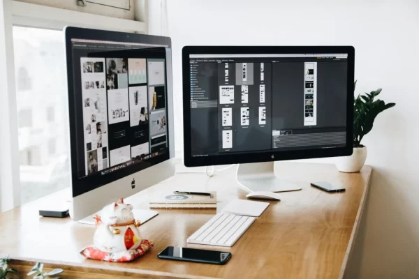
In today’s fast-paced digital world, your website is often the first impression people have of your business. With the rise of mobile browsing and instant information access, web design has become more than just aesthetics—it’s a powerful tool to build trust, convert visitors, and drive business growth.
Whether you’re creating a new site or revamping an existing one, understanding the fundamentals of web design—and the pitfalls to avoid—can make all the difference.
Key Takeaways
- Your website is a powerful first impression—make it count.
- Good web design balances visuals, usability, and performance.
- Avoid clutter, confusing navigation, and slow load times.
- Mobile responsiveness is no longer optional—it’s essential.
- A strategic, user-friendly site helps drive traffic, build trust, and convert leads.
- Investing in professional design can deliver long-term results for your business.
Table of Contents
- 8 Common Web Design Mistakes to Avoid
- Why Web Design Matters for Your Business
- Need Help With Your Website Design
- Frequently Asked Questions (FAQ)
What Is Web Design?
Web design is the art and science of planning, creating, and maintaining websites. It involves everything from layout and typography to usability and performance. A well-designed website strikes a balance between visual appeal and seamless functionality, offering users a smooth, intuitive experience across all devices.
Essential Elements of Good Web Design
Designing a website involves more than picking colours and fonts. To ensure your site is engaging and user-friendly, focus on these key elements:
Visual Elements
Typography: Choose fonts that are clean, readable, and consistent with your brand personality. Avoid using too many font styles across a page.
Colour Scheme: Stick to a cohesive palette that reflects your branding. Use colour psychology to subtly influence user behaviour and mood.
Shapes & Graphics: Use shapes and graphics to draw attention to key areas—like calls-to-action—without overwhelming the user.
Spacing: White space is your friend. It helps reduce clutter and makes content easier to digest.
Videos & Images: High-quality visuals boost engagement. Just be sure they’re optimised for fast loading times.
Written Content: Content is king—not just for SEO, but for user experience. Keep it clear, concise, and relevant.
Layout: A logical, grid-based layout helps users navigate your site easily. Prioritise a visual hierarchy to guide their eyes toward important content.
Functional Elements
Navigation: A clear menu structure keeps users from getting lost. Include sticky headers, breadcrumbs, and intuitive CTAs.
Responsive Design: Your site should look and function flawlessly on every screen size—from desktop monitors to smartphones.
Speed & Performance: Users won’t wait around for a slow-loading site. Compress images, use caching, and minimise scripts to boost performance.
Browser Compatibility: Your site should work seamlessly across Chrome, Safari, Firefox, and all major browsers. Cross-browser testing is essential.
User Interaction: Forms, buttons, sliders—every interaction point should be easy to use and clearly designed.
8 Common Web Design Mistakes That Hurt Your Business
Even with the best intentions, certain design missteps can sabotage your site’s performance and user trust. Here’s what to avoid:
1. Cluttered Layouts
Too many visuals, dense text, and no breathing room make your site overwhelming. Keep it clean and focused.
2. Not Mobile-Friendly
With over half of web traffic coming from mobile, responsive design is a must. Use Google’s Mobile-Friendly Test to check your site.
3. Slow Loading Times
A delay of just a few seconds can cause visitors to bounce. Aim for load times under 2 seconds.
4. Confusing Navigation
If users can’t find what they’re looking for quickly, they’ll leave. Make navigation intuitive and consistent.
5. Unreadable Text
Hard-to-read fonts, low-contrast colours, and long blocks of text kill user engagement. Stick to legible fonts and short paragraphs.
6. Inconsistent Layout
Weird or inconsistent layouts can confuse users. Stick to a grid structure and maintain a consistent visual flow.
7. Lack of Clear CTAs
Don’t leave users guessing what to do next. Use visible, action-driven CTAs to guide them through their journey.
8. DIY Web Design Without Experience
Designing your own website without the right skills can backfire. A professional web designer ensures your site is optimised, functional, and on-brand.
Why Web Design Matters for Your Business
Your website isn’t just a digital brochure—it’s a conversion tool, a customer service portal, and the heart of your brand’s online presence. Poor web design can damage your credibility, lower your search rankings, and turn potential leads away.
Investing in high-quality, strategic web design ensures:
- Better user experience
- Increased conversions
- Stronger brand identity
- Higher search engine rankings
Need Help With Your Website Design?
If your current website isn’t performing the way you’d like—or if you’re starting from scratch—partnering with a trusted web design agency can make all the difference. Our Melbourne-based team specialises in creating responsive, results-driven websites for businesses just like yours.
Frequently Asked Questions (FAQ)
How important is web design for SEO?
Very. Search engines favour websites that are fast, mobile-friendly, and user-focused. Design influences all three.
What is the most common web design mistake?
Failing to make your site mobile-responsive is among the biggest mistakes. It affects usability and SEO.
Can I design my own website using templates?
Yes, but templates have limitations. If you’re serious about growing your brand, hiring a professional ensures your site is fully optimised.
How often should I update my website design?
Ideally every 2–3 years, or whenever your branding, audience needs, or technology changes.
What should a good homepage include?
Your homepage should have a clear value proposition, intuitive navigation, strong visuals, and obvious calls-to-action.
So, if you are new to building a website, it will be a huge mistake not to trust a professional to do the job for you.
A website is an essential part of your marketing plan. It must be carefully thought out, designed, and implemented. Then it needs to be managed, maintained, and promoted. If you need assistance from an established Melbourne website design agency, we’re here to help. Grab your lifeline now!


